Twin Factory is a web app that provides (RTM) real-time managers with intelligent and powerful tools to forecast, monitor, and optimize their customer support queues to deliver better results.
The scope
The Twin Factory web app was already implemented by an outsourcing company and the management at Vodafone decided to build an internal team to own this project.
The scope changed entirely after conducting my research and convincing the management by numbers that we need a revamp.
My role
I was hired to work as a solo designer on this project and started by getting a hand-off from the outsourcing company, but my role changed over time to revamp the app working along with the product owner and engineers.
The problem
Customer support managers at _VOIS use tons of tools to monitor their queues and prepare reports every 3 hours which takes a big portion of the day.
The company already invested in building a web app to replace these tools but the outcome that we received appeared to need extensive testing putting our users in mind.
Approach
Multiple field studies and usability testing with our RTMs were needed to see where we stand from their perspective. After running 8 sessions we found:
The built app does not replace the need for the other apps.
It has a lot of usability issues that obstacle the critical work paths.
It takes about 20 minutes to export, analyze data and create one report.
Insights
After conducting the usability sessions discovered:
It’s really hard to read, interpret and play with the data.
A lot of unnecessary navigation for things that need to be together.
It’s not adaptable to their work needs.
Sometimes the data is out of its context.
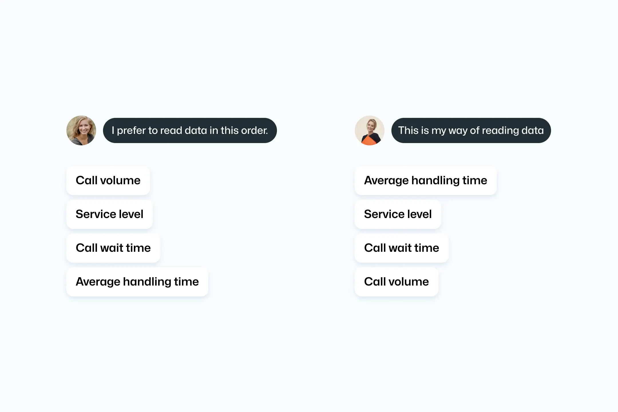
📊 People perceive and use data differently
While the goals are shared, people work uniquely. That’s why making everyone see the same data and use the same filters isn’t the best approach.
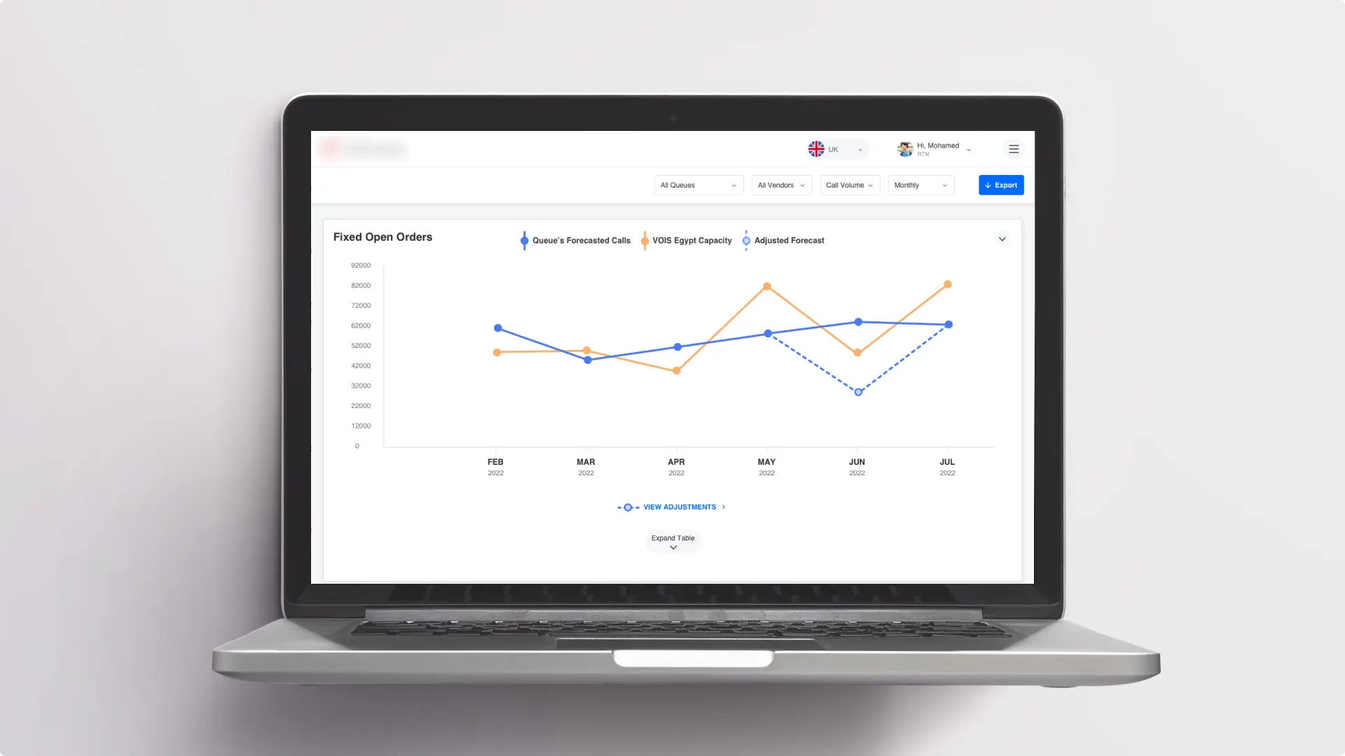
“I prefer seeing call volume vs forecasted, other stats later.” “For me, AHT tops the list. Others matter too, but AHT is key in real-time monitoring.”
I introduced “Custom Views” to let managers create their own workspace. With custom views, you can add, move gauges, charts, and adjust metrics and trends. It’s about making things work your way.
🏃🏻 It takes forever to reach the bottom
Our research showed people spent a lot of time scrolling to compare data at the top and bottom of the page.
To get to the bottom, you had to scroll through 4 charts for each queue.
I proposed splitting the data into views, so you can switch between them. Plus, you can easily expand or collapse each queue.
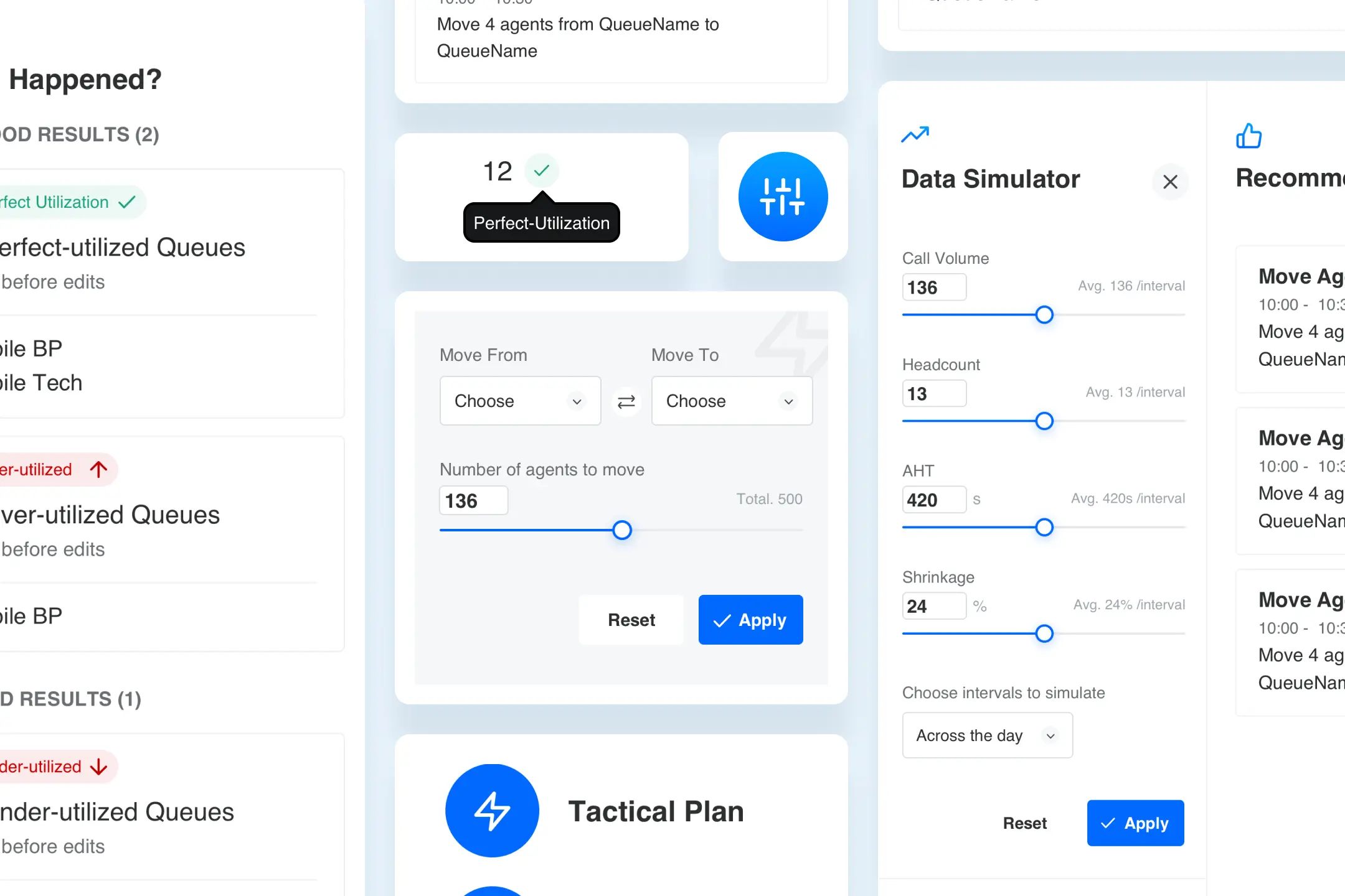
🔎 Can’t see data simulation impact
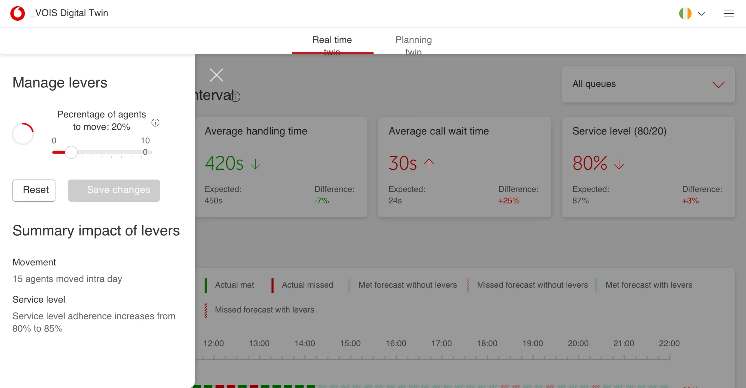
Before, we had “levers” for changing variable numbers and seeing forecasts change. But, you couldn’t watch changes while editing, needing lots of back and forth.
Now, we fixed this with the “Data Simulator.” It’s a simple tool. You slide to change numbers and instantly see the impact, all in one place. No more going back and forth.
The tests showed that people didn’t understand what changed after playing with sliders that’s why I added the “What happened” section to see at a glance what did your changes impact.
🗿 People prefer Excel sheets, always
Employees enjoy Excel for numbers and reports. The old design hid the export button in the middle, so many missed it.
Now, I put Export on all pages. Pick report types easily, no big files they don’t need. Just export and they’re ready to create their next report in less than 1 minute.
Time traveling causes problems
Using the “Data History” feature, you could see past numbers by picking a day from the settings page. The problem we discovered is; people forget they’re on a different day when they return to the main page, showing wrong numbers.
I introduced the “Time Machine” feature. Always there, it lets them travel back and forth. This keeps the user on the right day with the correct numbers.
Scalable apps center
We envisioned future mini-apps to add, which meant an architecture edit was a must.
In the new design, I made the Apps Center. Now, you can access all your apps in one place, no endless tabs are needed.
Impact
We helped RTMs in decreasing reporting time and improved their time on task on the app by 40% which led to acquiring the product and started relying on it.