Warehouse management system
WMS systems also can be usable, surprise?

About project
A warehouse management system (WMS) is software that improves warehouse operations. It handles inventory, tracks items, and boosts logistics efficiency. With real-time data and automation.
The problem
Our warehouse has been using Odoo for several months. While Odoo is nearly a good system (excluding design), it wasn’t customized to fit our exact needs. This led to extra features and background processes that end up slowing down the system.
Several factors led to the need to build our system:
- Too much unused features.
- The system steps didn’t match our process.
- The system is too slow.
The goal
Build a mobile application for warehouse employees to use in all their tasks.
My role
I led the research and design, working closely with the product manager, warehouse manager, and engineers to plan and prioritize our goals.

Deep dive
As we’re designing for people in a different setting, I did a field study.
I stepped into their role, working as a warehouse employee. This helped me experience their tasks, learn their behaviors, and find how they work around challenges.
Who am I designing for?
A man works 9 hours daily in a busy place, aiming for the easiest way to finish his tasks. He’s very busy and often does repetitive jobs subconsciously, which can lead to problems if not checked by someone else.
#busy #crowded_place #repetitive_tasks
What are their tasks?
There are three main tasks;
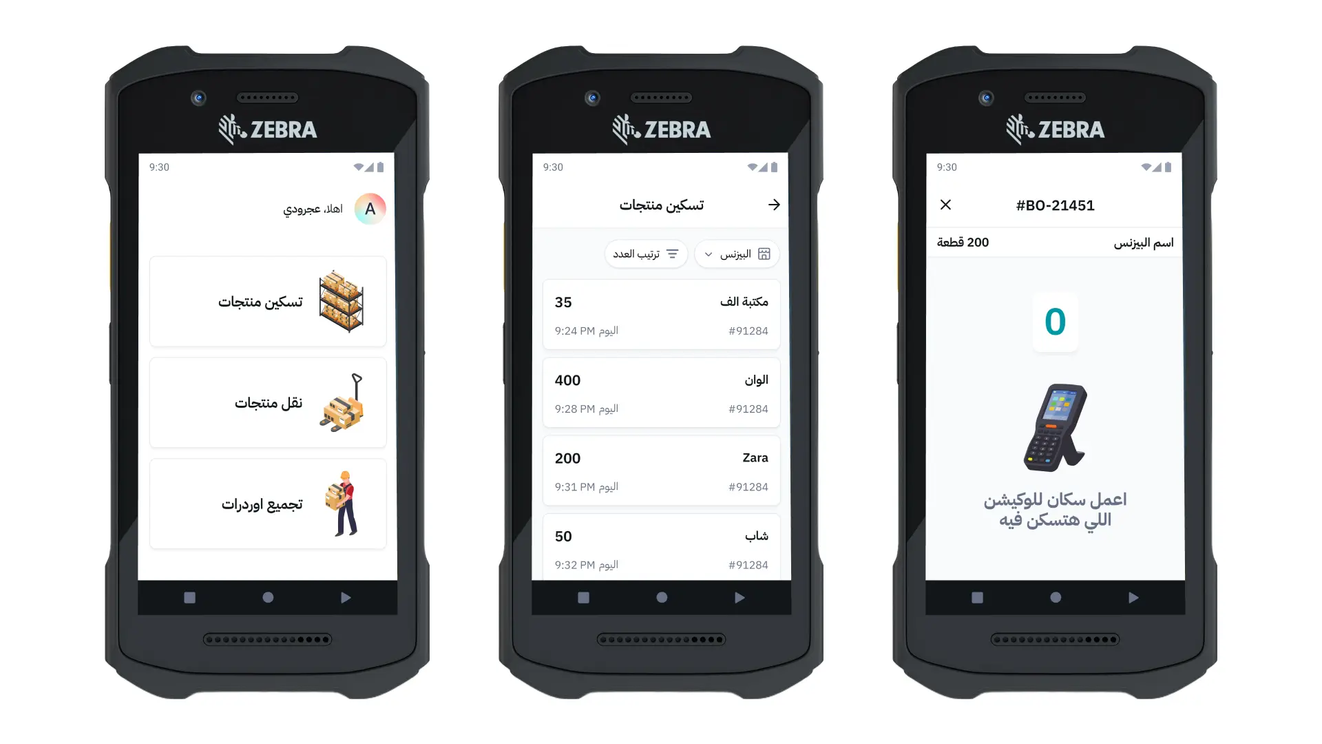
- Import merchant items
- Transfer items internally
- Prepare orders for shipping.
What are their surroundings like?
I can describe working in a warehouse is like walking in a busy street with no one talking, just the beeps of scanners and pallet jacks moving all around you.
These observations shaped how I approached the design.
#crowded #noisy #scan_beeps #pallet_jacks
Interesting insights
They always find workarounds to complete tasks quickly and meet their targets even the system is not helping.
There’s no time for reading labels, actions, steps or guides, as the device they use is too small and the text is usually in English and they’re not familiar with it.
Once they get used to the system they’ll use it subconsciously in repetitive tasks.
Designing for their devices
The app will operate on PDAs, which is a device that operates using android system but with more capabilities in scanning barcodes and higher speaker.
The problem with the device is it’s meant to be handheld so the screen is small and the bezels are black and large, leaving the eye to visualize the screen to be smaller than usual.
That’s why I took the approach of the extensive usage of white spaces everywhere in the app to give their vision a restful experience.

Visuals instead of text
Most of the time they don’t read. That’s what I observed working with them.
They just need a clear way to know what is the right action in a specific context, what are the errors, and they’ll get used to it, really fast.
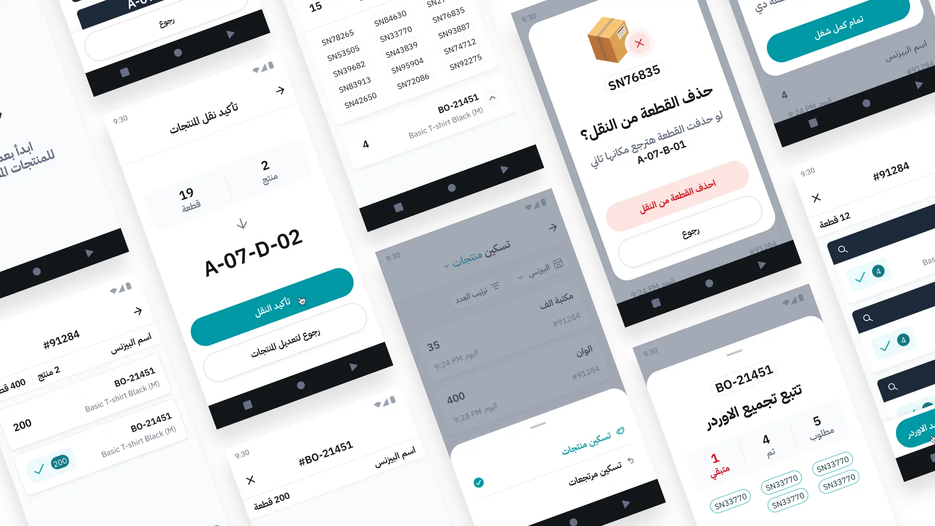
That’s why I visualized alerts, errors and success feedbacks so they know what is the problem at the first glance.
Handling orders with one hand
It was clear that our users always use the device with one hand while the other hand is holding the scannable item.
That’s why I designed the actions to be huge and made sure every singe action is within the reachable areas.
Multiple ways of feedback
Our users are usually busy with their tasks, they do their work without noticing the screen that much. It was critical to find other ways to notify them of errors that stops the process.
We used sounds, the device was already beeping on scanning, we added other sounds for errors and successes.
At any regular time the warehouse is all beeping, so you don’t know if it’s your device. That’s why I used haptics (fallback and success vibrations) to vibrate in users hands when error happen or a task is finished.
Using their jargons
Just like any workplace, there are terms only those working there understand.
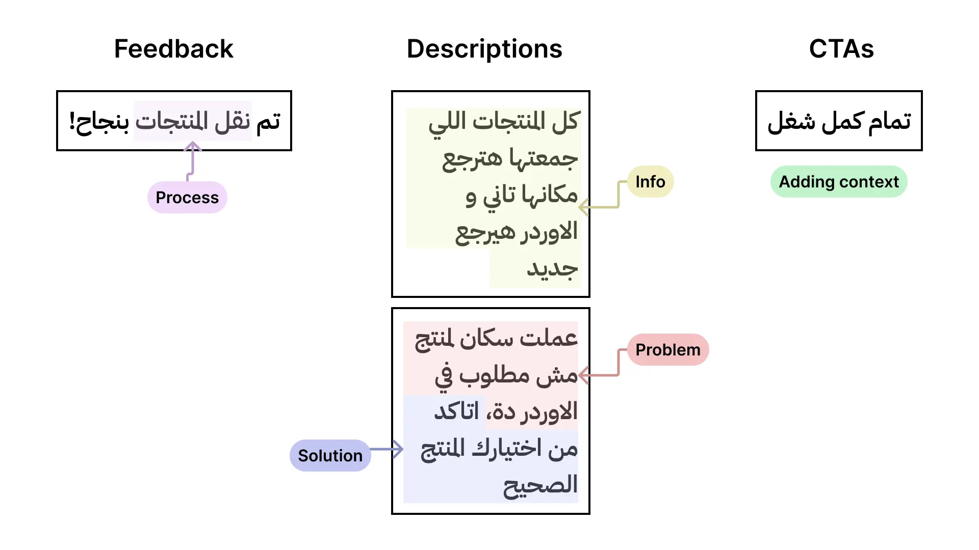
After spending time with them, I made an effort to grasp these terms and incorporate them into the designs. This created a robust app that resonates with them and truly feels tailored to their needs.
I designed the microcopies putting their behaviors in mind, for example, the new CTAs boosted their trust in where they should click without thinking much.

Next steps
Currently we’re in the testing phase, I’m crafting a usability testing plan to try out the critical paths with our users.