Insights, examples, practical guides, and real case studies.
Who will benefit from this gem? 💎
People working on digital products that is being used in a crowded and loud environments.
People who want to take their app’s experiences to the next level.
In this gem I provide useful insights, examples, practical guides, and real case studies of using haptics in the logistics industry.
Haptics in a nutshell
Picture this: You’re on a noisy bus with your phone ringing in your pocket. Chances are, you won’t hear it.
But, your phone can vibrate when it rings. This vibration is a perfect example of haptics.
It’s like your phone tapping you on the shoulder, saying, “Hey, something’s happening!” It’s a simple and natural way to let you know what’s going on.
Made to feel real
Starting from this point we can call a haptic is a way to communicate interactions and feedbacks in a physical sense to enrich your users’ experience while using your product.
It’s an instant feedback that people can sense. It feels real.
Examples you can try
If you try to send a voice message on WhatsApp but cancel it midway, you’ll feel a haptic vibration that tells you it’s canceled, and you’ll subconsciously understand it.
When you play FIFA on a PlayStation, the controller uses haptics to make the game more immersive. When you shoot, pass, score, or tackle someone, you can actually feel the action.
Haptic + Audio + Visual = Rich experience
Haptics are used along with other methods of feedbacks e.g. audio and visuals to create a rich experience.
Taking an example from Apple, try to unlock your iPhone with a wrong passcode, here’s what will happen:
Visual: the lock icon will animate as a metaphor of someone tells you it’s incorrect.
Haptic: You’ll feel a failure pattern.
Another example; try to force-click flashlight on your iPhone to turn it on, here’s what will happen:
Visual: The flashlight icon will bounce and change colors.
Haptic: You’ll feel a hold-and-release haptic pattern.
Audio: You’ll hear the force-click sound.
Haptics elements
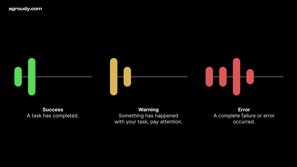
Haptics can be defined by two characteristics; strength and pattern.
Strength is how powerful it is, and it can be customized in two ways:
Intensity: Starting from (0) and ending with the maximum (1); Small elements should be less intense while large elements or actions can use higher intensity.
Sharpness: Also starting and ending with the same range; Low sharpness indicates round and organic feel, while high sharpness feels more precise.
Pattern is how it feels; Ascending pattern indicates a success, while descending one indicates a warning.
Flat pattern indicates a click/tap. While if you added a high event in the middle it can indicate an error (feels like something interrupted your task).
A buzzy pattern is a long vibration that plays when needed, like the one that plays when you receive a call.
People are used to certain patterns
It’s important to be consistent when using haptics. If your users are used to a certain haptic pattern for errors, stick with it in the same situations.
An error haptic pattern is totally different from success pattern. People do feel it and they’re already familiar with haptics from other apps and the OS itself.
Follow the recommended patterns, and only customize when necessary. In most cases, sticking to the default patterns will enhance your product’s user experience.
Users can switch off haptics in their device settings. Depending solely on haptics for feedback is a problem.
That’s why it’s crucial to use visual, audio, and haptic cues together to deliver the same message clearly.
Your app should be working normally and people still enjoy it haptic-free.
Important tips for perfect haptic usage
Make sure to use haptics consistently across all your product platforms.
Haptics should work seamlessly with other feedback methods. For instance, animation should sync up with both haptic and sound cues.
The event that triggers the haptic should be visible and clear to the user.
Overusing haptics in your product will feel unpleasant and will lose the meaning of sensing what is most important.
Applying haptics in game experiences is different. Usually gameplays require different kind of heavy haptics usage.
Practical guide: How to put it in use
Step 1
Start by thinking about your potential user’s surroundings while using your app.
1.0 EXAMPLE
Drivers use Google Maps with one hand on the phone and the other on the steering wheel.
This situation often demands a significant reliance on visual, auditory, and haptic feedback to communicate the interactions.
2.0 EXAMPLE
iPhone alarms are typically set when you’re about to fall asleep and are in the process of turning the alarm on.
In this scenario, haptics are really helpful in confirming that the alarm is turned on by providing a tactile vibration, even when you’re not fully focused on the screen.
Step 2
List all your app success, warning and failure events. Use notion for this task and define the needed patterns e.g. Success, Warning, Failure, Buzz, Clicks, Hold, etc… for each event.
Check each platform guidelines to make sure you understand the differences.
If you need customization, talk to your team and involve the software engineers in the conversation.
1.0 EXAMPLE
On Facebook, a success event happens on sharing a post.
2.0 EXAMPLE
On iPhone AirDrop, a failure event happens when a contact decline your request.
💡 Idea
Use this tag in your Figma canvas to show which events will play a haptic.
Make sure the numbers refers to the haptic event in the Notion file we talked about in the previous step.
Add haptics to your prototype
Good news! You can add haptics to your design prototypes that allow you to see how it will affect the experience and possibly test it with your users.
Figma doesn’t support haptics for now, but Origami Studio by Meta does. It’s an incredibly great prototyping tool. Also, Flinto does the trick.
Download Origami Studio app on your phone (Apple only).
Try your prototype.
When haptics are not enough: A real case study
Introduction
Designing for people in a loud environment is challenging because you have to deliver instant feedback in many different ways that they can sense.
The case
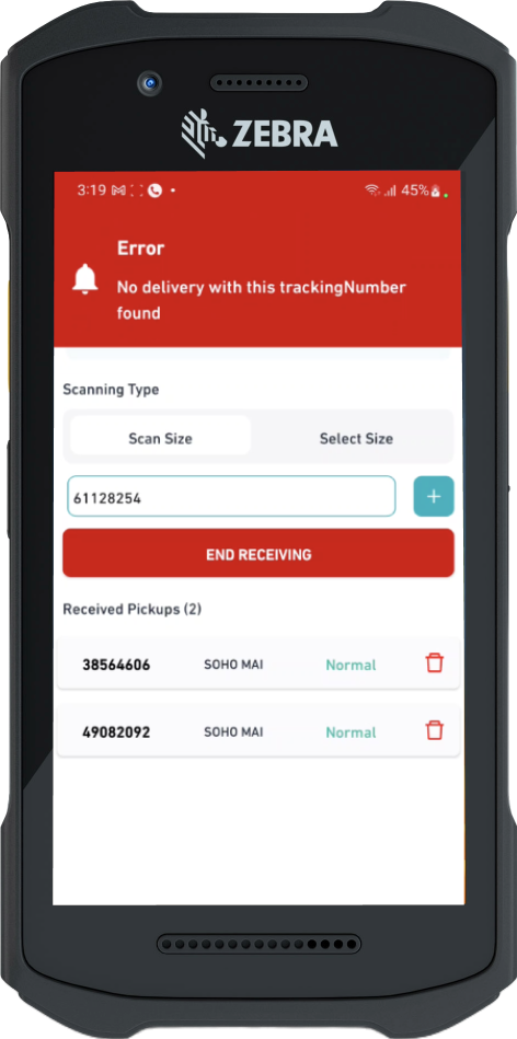
A shipping company provide an app for its workers to scan shipment barcodes, check their status, and take actions.
Each worker must efficiently manage hundreds of shipments within minutes using this app.
The problem
Each shipment has a status, and some statuses cause an error that needs to be seen and handled by the worker.
Therefore I need to make sure each worker see the errors on time to avoid mistakes that could cost a lot to fix them.
The current design
The current design displays a red error along with a buzzing sound.
After a while, we realized that the sound wasn’t effective due to the constant loud and buzzing environment.
After spending some time in that setting, it became challenging to determine whether it was your own device ringing or someone else’s.
The cost of the problem
As a result, shipments are often overlooked and redirected to wrong destinations, causing delays in customers receiving their orders. Consequently, businesses frequently report these issues to customer service.
Initial solution: Adding haptics
Another layer of notification was added by enabling intense, sharp, and long-duration vibration pattern on error occurrence.
Haptics are not enough
After some time, we discovered that the vibration wasn’t enough because workers hand got used to it.
Now the question is, how can I get the worker’s attention every time an error occurs?
Solution: Flashing errors
Instead of showing a minor red error, I redesigned it to take full-screen with bright red color that could grab their attention.
Along with this, I made the error flash as long as the worker didn’t see it and take an action.
Rich experience
Going back to the top of this gem, I introduced the concept of full feedback system: Visual, Audio, Haptics.
That’s an example of how all of them work together to achieve the goal.
What do you think?
I’d love to hear your thoughts, let’s connect on LinkedIn
 The Art of Haptics in UX Design